
Armed with nothing but a messy 84000+row CSV file, my Excel, SQL, and R knowledge, I had to prepare a report for a hypothetical bike-share company. I aimed to provide my stakeholders with valueable insights as to how they could improve the efficiency of their company and encourage more people to upgrade to their premium membership.
The formatting for this project may be a little different than some of my later projects. While I was free to complete this project however I pleased, I was provided this outline for inspiration.
Keep reading to see this project’s journey through each stage of the data analysis process.
ASK
PROBLEM STATEMENT: Investigate how to convince casual cyclists in a bike share in Chicago to sign up for annual memberships.
The insights generated from this analysis can be used to guide the company, (known as Cyclistic) to allocate its resources in the most effective may possible to maximize the number of casual cyclists that sign up for annual memberships.
In this project, I have three (fictional) stakeholders.My first stakeholder is Lily Moreno, the director of marketing at Cyclistic and my manager. My other two stakeholders are the marketing analytics and the “notoriously detail-oriented” executive team at Cyclistic.
PREPARE
For this project, I am given the following file, which contains a CSV (comma separated value) file of 84776 trips taken with Cyclistic. This data contains the start and end times of each trip, the start and end locations of each trip (coordinates and addresses), the membership of the rider, as well as the type of bicycle rented and a string of characters called the ride_id. The trips contained within this dataset took place from April to May of 2020. While I did have the option to combine this dataset with other datasets from other months, doing so would make the resulting file too large to use with Microsoft Excel on my current computer. I wanted to use Excel for this project, so decided I would focus on this CSV file exclusively.
My first task was to sort and filter the data. In Microsoft Excel, I used
=COUNTIF(A1:M84777,"")
to determine that there were 396 empty fields. Since this is a lot of data for excel to handle, I decided to move the file to SQL to remove all rows with empty fields. With over 87000 rows, removing a mere 396 fields would probably not impact my findings too much. For this project, I used Google BigQuery, an online SQL platform. Additional cleaning will happen later. I removed all rows with empty data fields with the following query:
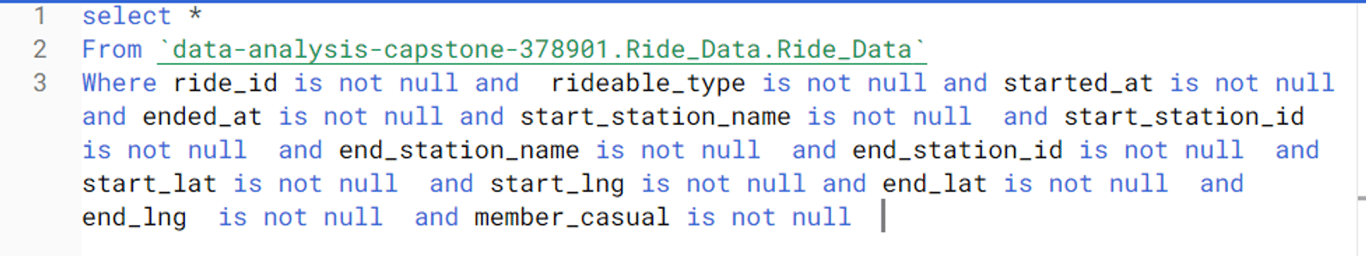
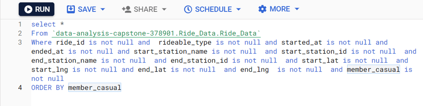
It was interesting to note that after this step, 84667 fields remained. Fewer fields were removed than I expected, meaning that there were several rows with multiple fields missing. This is good from a statistical perspective, as fewer data values had to be omitted.Next, I had to sort the data. The project outline that I was following from the course did not specify how I was supposed to sort my data. Since the whole purpose of this project was to investigate casual and annual memberships, I decided to sort by value of the membership column. This was accomplished simply by adding a the line “ORDER BY member_casual" into my query. This is what my final query looked like:
With my data sorted and filtered, and with all the rows with blank fields removed, I saved the new CSV file. It was now time to move on to the Process phase of my analysis.
PROCESS
The third phase of my analysis process involved a lot more instruction from the guide. This phase was to be completed in Microsoft Excel.
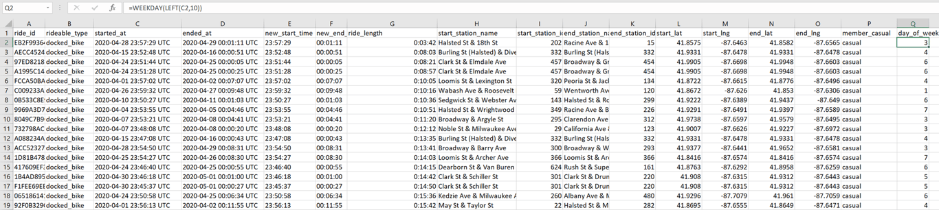
My first task was to create a new column called “ride_length” by calculating the difference between the “started_at” and “ended_at” columns. However, these columns had to be cleaned since they had a date and time zone included.
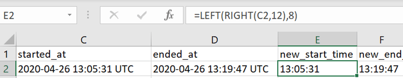
Using nested RIGHT and LEFT formulas, I created two new columns of just the start and end times of each trip in the format of HH:MM:SS. I named these columns “new_start_time” and “new_end_time” respectively.
Then, formatting these fields as time values, I subtracted the values in new_start_time from new_end_time to determine the duration of each ride. These values went into the column ride_length. I did one final ascending sort in the column ride_length just to make sure I did everything properly when I noticed that I had made a mistake in my method of data cleaning.
Suppose someone rented a bike before midnight, and returned it after midnight. My method of data cleaning would mean that this person would have had a negative trip duration. Since these cells are formatted as times, Excel returned a never-ending cascade of hashtags for the first 382 rows. I had to fix this.
I copied those 382 rows into their own sheet. In this sheet, the value for ride_length was an integer. I froze the title rows, and I created a new column called new_ride_length. I used the following formula to fix these values.
=1-ABS(ride_length)
This fixed those pesky negative trip durations. I also removed six zero second trips manually. However, now I noticed that there were fields where the trip occurred within the same day, but the trip ended before it even began. These fields had to be eliminated. To do this, I set up a column called same_day, which returned TRUE if the start and end dates were the same, and FALSE if the dates were different. This column had the following formula:
=(LEFT(C360,10)=LEFT(D360,10))
Every column that returned TRUE was removed, and these fields were added back into the original dataset. I did a sort on the rideable_type and member_casual columns to ensure that no other data was inputted incorrectly. I manually found how many days each trip over 24 hours lasted using the following formula:
=RIGHT(LEFT(D119,10),2)-RIGHT(LEFT(C119,10),2)
I did this because it was needed for when I calculate the mean trip duration during the analyze phase. Since ride_length had to be formatted as a time variable as mentioned in the guide, I put the number of days of each multiday trip in a column called “day_difference”, and I did the same for trips spanning multiple months. Fortunately for me, no trip lasted longer than 30 days. Now, by spreadsheet consisted exclusively of trips where the start time preceded the end time even if the trip took place over multiple dates.
As outlined in the guide, there was one more step that I had to complete for the process phase of my analysis. I created a column called “day_of_week” using the **=WEEKDAY** formula (and CRTL+D to fill the entire column without scrolling down with the fill handle) for the starting date of each trip. This created an integer where 1=Sunday, 2=Monday up to 7=Saturday. I also did a sort of the rideable_type and member_casual columns to ensure that all the data made sense. This is what the spreadsheet looked like:
At this point, data cleaning is finished and my spreadsheet has 84620 rows. With this complete, I saved my revised CSV file, and moved on to the Analyze phase.
ANALYZE
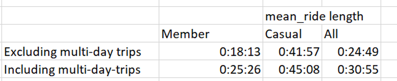
With all of that data cleaning out of the way, I could finally begin analyzing my data. Although the project guide told me to summarize the results by season, the files given to me only had data from spring of 2020. My first task in the guide was to calculate the mean trip length. For that, I converted the variable ride_length (which if you recall is the duration of a trip without accounting for trips lasting over 24 hours) into a number, ran this formula

and then converted this value into a time. This revealed that the average trip duration for all trips, (including multi-day trips) was 30 minutes 55 seconds. I calculated the average trip duration for members and casual riders as well. This is the formula that I used for membership holders:

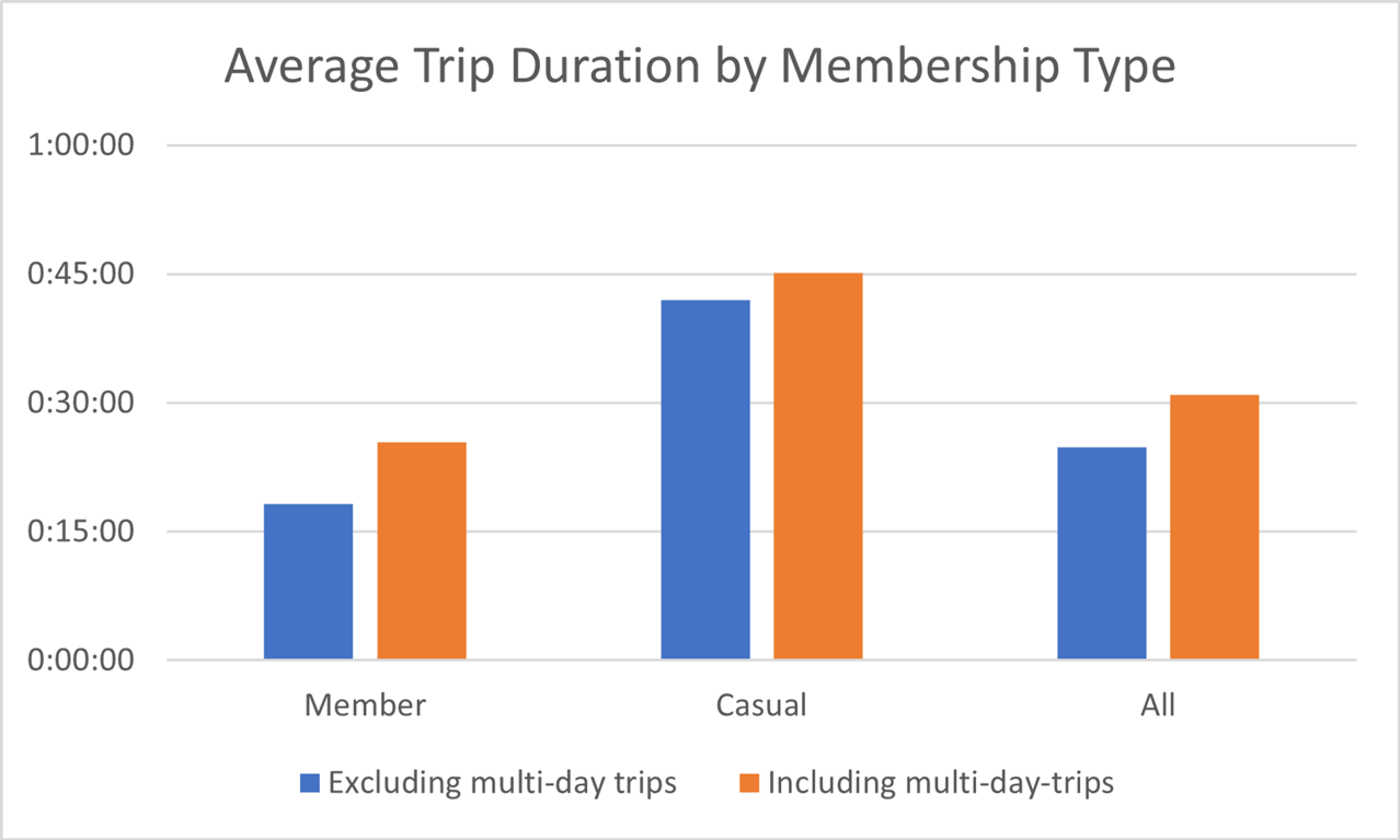
I used a similar formula for casual riders.I wanted to know how much of an impact multi-day trips had on the average trip duration for members, casuals, and the average as a whole. I created this table:
Which I then used to create this bar graph:
I then wanted to know the relative amount of trips taken by annual members and casual riders. I determined that 72.2% (n=61054) of all trips were taken by members, and the remaining 27.8% (n=23565) were taken by casual riders. This can be seen in this chart:
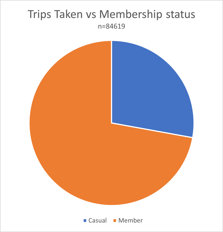
I decided to use a pie chart for this data since I wanted to show proportions of a whole.The longest ride ever taken in this dataset was ride B265681EFE107B08. This trip took a whopping 27 days, 15 hours, 18 minutes and 51 seconds. I determined this by sorting the column containing the number of days each trip took.The mode, or most common day of the week that a trip was started was Sunday (which corresponded to the integer 1 in column Q of this dataset). Saturday was the next most common day of the week that people used Citibike’s services. The spike in bicycle rentals on weekends suggests that many citizens of Chicago enjoy biking recreationally on weekends.I noticed a few trips were only a few seconds long. I decided to keep these data because I do not know the circumstances surrounding those trips. By omitting these short trips, I have no real argument against removing the multi-day trips. This would cause me to go down a slippery slope of having to define how long a “trip” must last, and this runs the risk of my data losing accuracy by unnecessarily omitting fields. The only “short trip” that I omitted was a zero second long trip that somehow evaded earlier data cleaning. This trip was removed for three reasons. The first being consistency with the removal of previous zero-second trips. The second reason was that an instantaneous trip makes no sense. The final reason was that this field caused some of my earlier formulas to stop working.In SQL, I ran the following query to determine the number of unique trips taken.
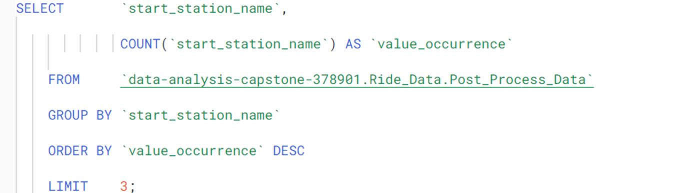
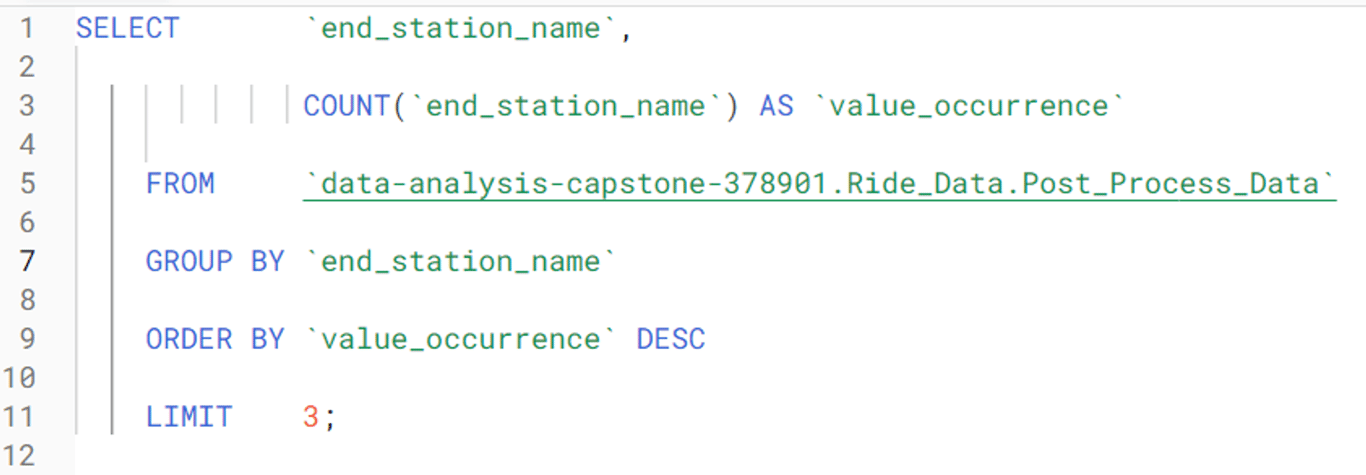
This returned 28043 trips with unique start and end station combinations. This means that the same exact trip was repeated on average only three times. I found this interesting since one would expect a large urban area like Chicago to have many unique trips repeated many times. If you live in a city, think about the places you go to in a typical month. You probably make some trips, like from your home to the place you work, or from your favourite restaurant to your home way more than three times per month. This means that Citibike’s bicycle rental services are likely being used less by people making regular, predictable trips (such as commuters), while being used more often by people with unpredictable movement patterns (such as people making deliveries). This made sense because during the time period covered by this dataset, the state of Illinois was under a “shelter in place” order. People were not commuting nearly as much as they normally do, and delivery drivers likely made up the bulk of all bicycle traffic in those weeks.I wanted to know the three most common start and end stations, so I ran the following queries in SQL (Note that removing the LIMIT statement revealed the total number of Citibike stations in Chicago was 607).
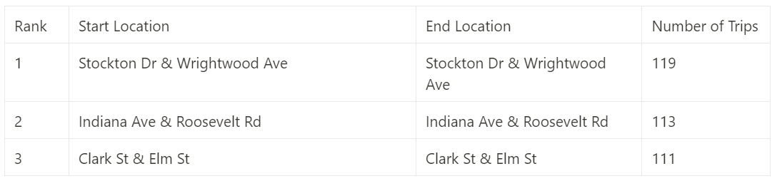
These tables illustrate the three most popular start and end stations:
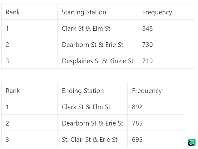
Since the starting and ending station frequencies were not the same for the first two stations, that got me thinking. Suppose there is a festival in one particular neighborhood of Chicago. One would expect several bicycles to have the same destination during this event, since people want to travel to the festivities. At the event, a storm system may move into the city, or festival-goers may grow tired, and arrange other forms of transportation back to their starting locations other than the bicycles that brought them there. Later, when these clients want to use another bicycle, there may not be as many available since so many bikes were left at the festival.I wanted to know the three most popular routes for these bicycles. Citibike may benefit from pursuing a method of scattering bicycles around the city to where they are needed if too many bikes end up in one place. It would be helpful if I could tell my stakeholders where these bikes must be moved to.I ran the following query in SQL to combine the start and end stations into a single column called “trip”:
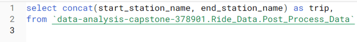
Next, I exported it and ran this query to group the number of trips together (note that I forgot to name the concatenation column):
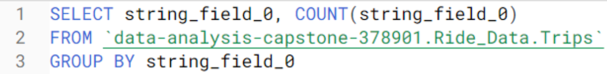
Which I then exported into Excel since now the CSV file was smaller and more manageable. I sorted the column with the trips by most often to least often. It was interesting to note that a lot of bikes were returned to the station that they were taken from.
Despite bicycle accumulation at some stations not seeming as much of a problem as I had originally anticipated, I still wanted to know the three most common trips where the bicycle was not returned to the location it was taken from. I wrote this formula to return TRUE if the start and end stations were the same, and FALSE if the start and end stations were different:

Of the trips that had a different destination than their start location, these were the three most common:
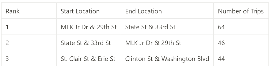
After careful consideration, I realized that this information was not very useful in choosing where to redistribute bicycles. However, this data can still provide Citibike with an idea of where they should prioritize advertising their annual memberships since these stations are where their customers tend to congregate. What I was really trying to find was the net accumulation and depletion of available bikes at certain stations—not the start and end locations of trips. With this information, my stakeholders will know where to put excess bikes to ensure that everyone who wants to use Citibike’s services is able to. To find the net bicycle surplus/deficit at each station, I ran the following SQL full outer join:
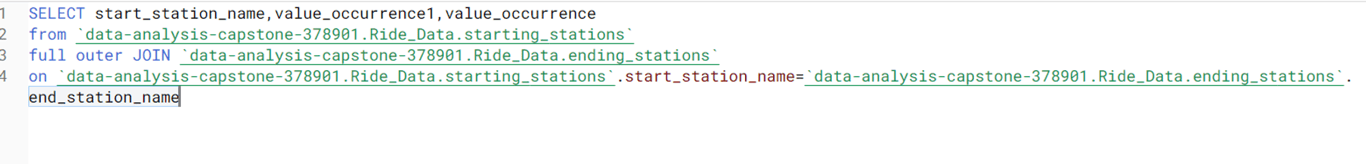
At this point, I had become pretty sloppy at naming my columns. In this case, value_occurance1 is the frequency that a station was the starting station, and value_occurance was the frequency that a station was the ending station for a bicycle. The query returned this table. The starting station frequencies for each station are in the middle column, and the ending station frequencies are the right-most column.
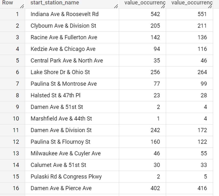
I exported this table into excel, and subtracted the end station frequencies from the start station frequencies to calculate the net change in the number of bicycles at each station over the time period covered in the data. Keep in mind that although I do not live in Chicago, in my city, it is incredibly rare for a bike share station to have more than a dozen bicycles. I sorted the data, and this is what I found.
These results were shocking. In the end, a staggering amount of bicycle accumulation had happened during the weeks covered by my data. Although the data that I was provided lacks any information on bicycles lost, stolen, purchased, or unrentable due to maintenance, I still believe that several bicycles accumulated in a handful of locations, while other stations had no available bicycles to rent. This would have discouraged potential customers, as no one would want to use a service from a company that cannot service their location. This lack of bicycles at some stations may have also turned some casual riders away from signing up for annual memberships. Now my Analysis was complete. I was ready to create a report to share with my stakeholders.
SHARE
With the analysis complete, it was now time to create the data visualizations that would be included in my final report. In excel, I used the COUNTIF formula to count the total number of trips taken on a particular day of the week. Then, I made the following pie chart showing the relative amount of trips that occur on a each day of the week.
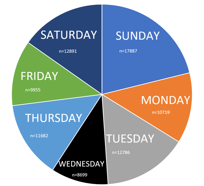
While the colour scheme may look odd to most people, the colours chosen in this pie chart maximize accessibility for people with red-green and blue-yellow colour blindness (which are the two most common types of colour blindness). This was the only data visualization that I created outside of the Analysis phase.
ACT
Now it was time to take my findings and use them to make informed business decisions. I created a PowerPoint presentation summarizing my findings, and the actions that I would advise my stakeholders to take. I wrote a script and recorded myself reading it while the slideshow plays. I was especially proud of the animations in the slide where I explain bicycle depletion and accumulation. I edited my video presentation, and uploaded it to YouTube.
Although I am very proud with how this project turned out, there are some things that I would have done differently. To start, constantly toggling between Microsoft Excel and Google BigQuery probably greatly reduced my productivity. In future projects, I should do as much work on one platform as I can at a time to minimize the time that I waste switching between platforms. Additionally, I limited myself in the platforms that I used. This career certificate introduced me to Tableau, a platform for creating data visualizations, as well as R, a programming language used by data analysts. Perhaps this project would have benefitted from using some of those other tools. I could have been more careful when using the “sort and filter” option in Excel, as I am not entirely certain that I kept all data fields in their original rows for the duration of this project. That being said, I am quite confident that I did not make this mistake, and even if I did, most of the conclusions drawn in this project rely on averages where the order of the data does not matter, meaning that even in the worst case scenario, my findings would still have been the same. For most other data analysis projects however, this would have had disastrous consequences and I would have had to restart the entire project. I could have been more careful in how I named my columns throughout this project, since after running a few SQL queries, I was left with columns with unintuitive names like f0. During the analyze phase, I tried to sort my trip durations from largest to smallest in Excel to determine what the longest trip was. As an Engineering student, I have had some experience with programing outside of this course, including with sorting algorithms, These algorithms are notoriously slow. Trying to sort over 85000 columns caused Excel to crash, and the four files that I had open to corrupt. Fortunately, I was able to recover some of my lost work. It was quite humiliating to make such a foolish mistake especially considering that I was already familiar with the inefficiencies of sorting algorithms. This project helped me appreciate the importance of saving my work as I go.
Regardless of the mistakes that I made, this project was a fun and interesting first data analysis project, and I am convinced that it definitely will not be my last.
 Made with Bullet